Tag Archives: promotional drinkware

How to Choose Promotional Product Colours That Suit Your Brand
🌈 Bright Merch Is Back (and We’re Here for It)
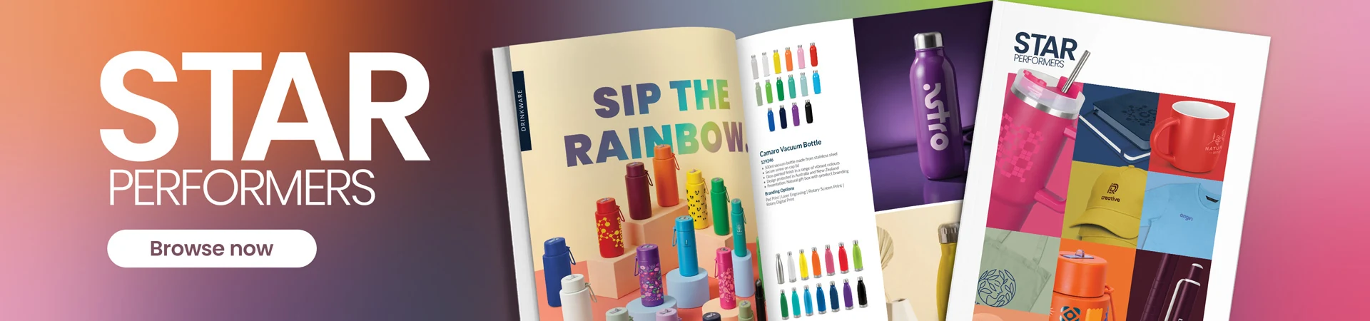
G’day, colour. The latest Star Performers range from Trends is not exactly shy: pinks, oranges, greens, blues and a whole spread of drinkware that looks like somebody tipped a paint chart across the desk. After years of black, navy and white doing most of the heavy lifting in promo, we reckon it is a welcome change.
The right colour gives merch a personality before anyone has even read the logo. It can make a bottle feel sporty, help a giveaway stand out across a busy event, or turn a plain pen into the one everybody pinches from the meeting room. The wrong colour can make a dog’s breakfast of the whole job. The logo disappears, the print looks dull, or five “close enough” blues turn up looking like five different companies.
This is not a breathless “look at all the new stuff” roundup. We want to help you pick a colour that suits the brand, the people receiving it and the place they will actually use it. Have a flick through Star Performers — edition three for ideas, then use this guide before you lock anything in.
🎯 Start With the Job, Not Your Favourite Colour
Here is where buyers come unstuck: they choose the colour they personally like best. A bright purple bottle might be brilliant for a school fun run and completely wrong for a conservative client gift. A matte-black notebook can feel spot-on in an executive pack and disappear into the scenery at a colourful outdoor event.
Before you open the colour chart, ask three things. Who is getting it? Where will they use it? What should it say about your business? A kids’ program can go playful. A construction induction pack needs something practical with branding that can be read in half a second. A design studio can probably get away with the odd curveball because creativity is part of what it sells.
If the product itself is still undecided, start with our guide to choosing promotional products before narrowing the colour. It uses the same audience, setting and must-work questions to turn a loose brief into a shortlist.
A quick colour brief that actually helps:
Audience: staff, clients, students, event visitors or the general public?
Setting: office, site, gym, school, conference or outdoor event?
Brand role: should it feel dependable, energetic, premium, playful or understated?
Practical test: is the logo still clear from an arm’s length away?
That last check matters more than any clever colour theory. If nobody can read the logo, the palette has missed the point.
🧩 Three Ways to Use Colour Without Making a Mess
1. Pick a stock colour that supports the logo
Stock colours are the easy road. The supplier already makes the product in a set range, you pick the best fit and we add the branding. It does not have to be an exact match to feel like your business. Quite often a white, black or neutral product with a crisp logo looks more deliberate than a near-match where the logo quietly vanishes.
The Camaro Vacuum Bottle is a ripper example. It runs from white and soft green through yellow, orange, pink, teal, blues, purple and black. That gives you room to create contrast, match an event theme or colour-code teams without turning the order into a full custom-manufacturing exercise.

2. Match the product itself to a Pantone colour
If your particular blue, green or red is a big part of the brand, custom PMS colouring can be worth the extra planning. PMS stands for Pantone Matching System. It gives everyone one proper colour reference instead of playing a painful game of “no, the other medium blue”. Our Pantone PMS colour chart explains the basics.
The Panama Palette Pen is made to order with a custom PMS barrel in gloss, matte or rubberised finish. It is a good fit when the pens really do need to land in one exact brand colour. It is not the “we forgot the conference is next Friday” option. The current listing states a 38-working-day production lead time, so tell us the required date before we all get attached to it.

3. Use the product as a canvas
Sometimes one tidy logo is not the idea at all. Full-colour decoration is where gradients, photos and proper illustrations get some room to breathe. Done well, the product becomes part of the campaign rather than a blank object with a logo parked on it.
The SPICE Calypso Bottle 500ml — Full Colour gives you a large wrap-style branding area on recycled stainless steel. The catch is time: its current listing states 40 working days for production, with sampling on top. If the event date is fixed, work backwards before you fall in love with the artwork. Future you will be grateful.

🎨 Not sure whether you need a stock colour, PMS match or full-colour print?
Send us the logo, audience, quantity and deadline. We’ll sort through the practical options and prepare a free visual proof before anything goes to production.
👉 Request a Quote →
🖨️ Same Logo, Different Surface, Different Result
Every job has two colour decisions hiding in it: the colour of the thing and the colour we put on the thing. White print on a navy bottle does not behave like navy print on a white bottle. A full-colour digital print does a very different job from a one-colour pad print, laser engrave or screen print.
Then the surface joins the party. Gloss paint bounces light around. Matte and rubberised finishes soften it. Recycled fibres can have flecks and natural variation. Laser engraving usually exposes the material underneath instead of adding ink. None of that means something has gone wrong; it just changes the finished look.
If colour accuracy matters, send the original vector logo and the PMS references from the brand guide. Please do not choose a colour from a screenshot on somebody’s website and call it done. Screens use RGB light; physical branding uses ink, thread, film or exposed material. Our artwork requirements page covers the useful file formats, and the printing processes guide shows what each method is good at.
Before approving the proof, check:
the product colour and logo colour have enough contrast;
small text and fine details suit the decoration method;
the artwork position makes sense when the product is held or used;
the proof lists the right PMS references, finish and colour split;
the approved version is the one everybody is actually working from.
🛍️ What We’d Actually Shortlist
Need plenty of colours without the custom-production palaver? Start with the Camaro Vacuum Bottle. If capacity, lid style or insulation matters more than the exact shade, have a look through the wider branded drink bottles range instead.
Want a smaller everyday giveaway? The Vistro Stylus Pen — Colour Match comes in a broad bright range and has a touchscreen stylus. It works nicely for staff teams, school houses or an event palette people should recognise at a glance. The wider pens and pencils range has quieter options if the rainbow is not your cup of tea.
Got artwork that needs room? The full-colour Calypso bottle is the loud option. The Ashbury Full Colour Notebook gives you customisable inner pages as well as cover branding. Its current listing states a 40-working-day production lead time, so this is one for the planned campaign, not a Tuesday-afternoon rescue mission.
Want something people will show each other? The Chameleon Colour Changing Cup reacts to ice-cold drinks. That makes it good fun at festivals and brand activations. The strength of the colour change varies with temperature and conditions, so buy it for the interaction, not laboratory-perfect uniformity.
📋 The No-Drama Colour Brief
You do not need to turn up with a perfect production brief. Honestly, a useful first email can be five lines. Tell us what the merch is for, who gets it, roughly how many you need, the deadline and the budget. Attach the best logo file you can find and any official brand colours. We’ll take it from there.
If you want a colour mix, give us the split. Fifty blue, fifty green and fifty orange is much more useful than “a mixture would be nice”. If exact matching matters, mention it early. Custom PMS products and samples can take a fair bit longer than stock-colour items.
Then have a proper look at the visual proof. Check the contrast, size and position, not just whether we used the right logo file. Too loud? We can shrink the print, calm down the base colour or look at engraving. Too flat? A better product colour may do more than blowing the logo up another 20%.
And no, making a proof does not lock you into the order. The whole point is to catch the wobbly idea before it becomes twelve cartons of wobbly merchandise. We actually answer our emails, and if the first option is wrong, we’ll sort it. No dramas.
Reviewed by Daniel Galpin, Co-Founder at PromoMate Australia
Product selection, print-method fit, colour planning and reducing order risk for Australian businesses, schools, events and trade teams. Meet the team →
❓ Frequently Asked Questions About Promotional Product Colours
1. Do promotional products need to match my brand colour exactly?
Nope. Exact matching is useful when colour is a big part of the brand, but contrast and readability matter more on plenty of products. A neutral item with a clean logo can look more consistent than a near-match that feels accidental. Custom PMS colouring is there when “close enough” genuinely will not do.
2. What is a PMS colour?
PMS stands for Pantone Matching System. It gives printers and suppliers a shared reference for a specific colour. It is more reliable than choosing a shade by eye on a screen, although the product material, finish and decoration method can still affect how the colour looks in real life.
3. Can I mix product colours in one order?
Often, yes, but it depends on the product, available stock and how the supplier packs it. Give us the exact split when you ask for the quote. We will check it properly rather than promising that every colour can be mixed in whatever quantity takes your fancy.
4. What artwork should I supply for accurate colour matching?
An AI, EPS or print-ready vector PDF is ideal, along with the PMS references from your brand guide. Only got a PNG or an ancient PDF somebody found in the shared drive? Send it anyway. We will check it and tell you what needs sorting before production.
5. Is full-colour branding the same as PMS colour matching?
No. Full-colour decoration reproduces artwork using a multi-colour print process and suits gradients, photos and illustrations. PMS matching targets a specified spot colour. The right choice depends on the artwork, product and print method; some jobs use both ideas in different ways.
6. Will the colour on my screen match the finished product?
Not perfectly. Screens emit RGB light, while physical products use inks, coatings, thread or exposed material. Monitor settings also vary. A digital proof is excellent for checking placement and scale, but if precise colour is critical, ask whether a physical sample or pre-production sample is available.
7. How much extra time does custom colour take?
It varies by product. Made-to-order colour and full-colour products can take several working weeks before freight. For example, the current Panama Palette Pen listing states 38 working days and the full-colour SPICE Calypso Bottle states 40 working days, with sampling additional. Confirm the current schedule before planning an event around it.
Got a colour question we did not cover? Ping us at [email protected] or send through a quote request. No dramas if the artwork is not tidy yet; send what you have.
⭐ Ready to Put Some Colour to Work?
Pick something the recipient will use first. Then use colour to make it feel like yours. Have a browse through the Star Performers brochure, or send us the rough brief and we’ll narrow the options down. Free visual proof, no obligation, and a real person at the other end of the email. Easy.
📚 More from PromoMate
- Corporate Christmas Gifts Australia: What to Order (and When) for 2026

- You’ve Been Asked to Sort the Merch. Where Do You Start?
- 8 Unusual Promotional Products People Actually Want to Keep
- How to Choose Promotional Product Colours That Suit Your Brand
- Budget vs Premium Promotional Products: What Actually Earns the Spend?
- Stainless Steel vs Plastic vs Glass vs Insulated Vacuum: Which Branded Drink Bottle Actually Suits Your Job?
- Cotton vs Non-Woven vs Jute vs Recycled Cotton Tote Bags
- Do Promotional Products Actually Work? What the 2025 APPA Data Shows